
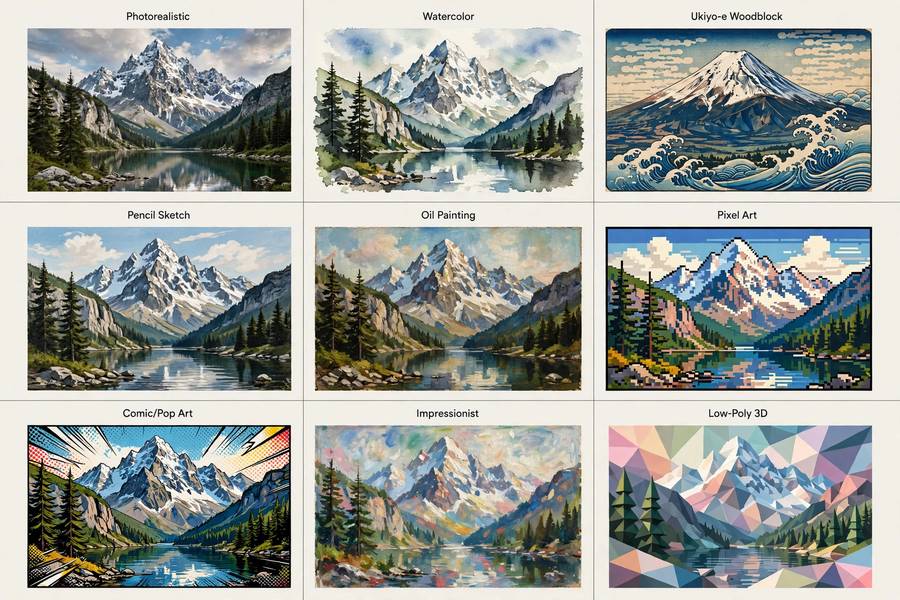
Style words are the highest-leverage words in any prompt. Change “photorealistic” to “watercolor” and the same subject becomes a different universe. But style prompting is trickier than it looks — “anime” means five different things, “vintage” is doing three jobs at once, and some style words fight your subject words for control. This guide maps the major style families, gives you the trigger words that actually work, and explains how to combine styles without making a mess. The creative context: can AI make art. The mechanics: how Midjourney works.
Table of Contents
- How Style Words Work in Prompts
- Photorealism and Photography Styles
- Traditional Painting Styles
- Anime, Manga, and Cartoon Styles
- Digital and 3D Styles
- Retro and Vintage Styles
- Fantasy, Sci-Fi, and Genre Styles
- Combining Styles Without Chaos
- Frequently Asked Questions
How Style Words Work in Prompts
When you write “oil painting” in a prompt, you’re not giving the model a technical spec — you’re pointing at a neighborhood in its learned space containing millions of oil-painting images. The model then renders your subject with the statistical properties of that neighborhood: visible brushwork, canvas texture, rich impasto, certain color relationships.
Three things to know about this mechanism:
Style words are fuzzy. “Anime” points at a neighborhood containing everything from Studio Ghibli to 90s OVAs to modern webtoons. If you want a specific flavor, add specifiers: “Studio Ghibli style” (careful with living-studio references for commercial work), “retro 90s anime cel,” “modern isekai anime key visual.” Precision in, precision out.
Style words compete with subject words. A strong style can overwhelm a weak subject description. If “cyberpunk” is eating your carefully described character, strengthen the subject (more concrete details) or soften the style (“subtle cyberpunk elements” instead of “cyberpunk”).
Order and emphasis matter. Words earlier in the prompt generally carry more weight. Put the style where it belongs in your priority stack — and if a style isn’t landing, repeat or rephrase it rather than adding more competing styles.
With that framework, here are the major families.
Photorealism and Photography Styles
The most-requested family, and the one where specificity pays most:
- Photorealistic / hyperrealistic. The baseline trigger. Add “8k,” “sharp focus,” “intricate detail” for extra fidelity — though modern models need less of this cheerleading than they used to.
- Photography sub-styles. These change everything: “portrait photography, 85mm lens, shallow depth of field” vs. “aerial drone photography” vs. “long exposure night photography” vs. “candid street photography.” The camera language tells the model how the photo was taken, which shapes composition, not just texture.
- Film looks. “Shot on Kodak Portra 400,” “35mm film grain,” “Polaroid,” “black and white Leica street photography.” Film stocks are distinct visual neighborhoods — Portra’s warm skin tones versus Ektachrome’s saturation are real, learnable differences.
- Editorial and commercial. “Fashion editorial photography,” “product photography on white background,” “architectural photography, wide angle.” These trigger professional-composition patterns: considered lighting, clean backgrounds, deliberate framing.
Photorealism tip: describe the capture, not just the look. “Golden hour backlight, lens flare, shot on 50mm” gives the model concrete visual instructions that “beautiful photo” never will.
Traditional Painting Styles
The fine-art wing, and a great way to learn art history by prompting:
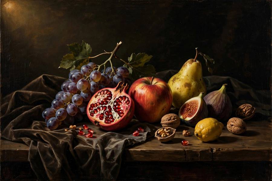
- Oil painting. “Classical oil painting, visible brushstrokes, impasto texture, chiaroscuro lighting.” Add eras: “Renaissance oil painting,” “Baroque,” “Romantic era.” Each era is its own neighborhood with distinct palettes and compositions.
- Watercolor. “Loose watercolor, wet-on-wet washes, paper texture showing through.” Watercolor’s translucency and unpredictability come through surprisingly well — it’s one of the styles AI renders most convincingly.
- Impressionism / Post-impressionism. “Impressionist, broken color, plein air light.” Or go specific: “in the manner of Monet’s water lilies” (long-dead artists are safer references than living ones).
- Ukiyo-e / woodblock. “Japanese woodblock print, flat color planes, bold outlines, Mount Fuji-era composition.” Distinctive enough that even the word “ukiyo-e” alone strongly steers results.
- Gouache and acrylic. “Matte gouache illustration, flat shapes” — the children’s-book and mid-century-illustration look. Enormously useful for friendly, approachable imagery.
Traditional styles are also where “study the masters” becomes literal prompt research: knowing that Caravaggio means dramatic light-dark contrast gives you better prompts than any parameter tweak.
Anime, Manga, and Cartoon Styles
A huge family with internal variety most guides flatten:
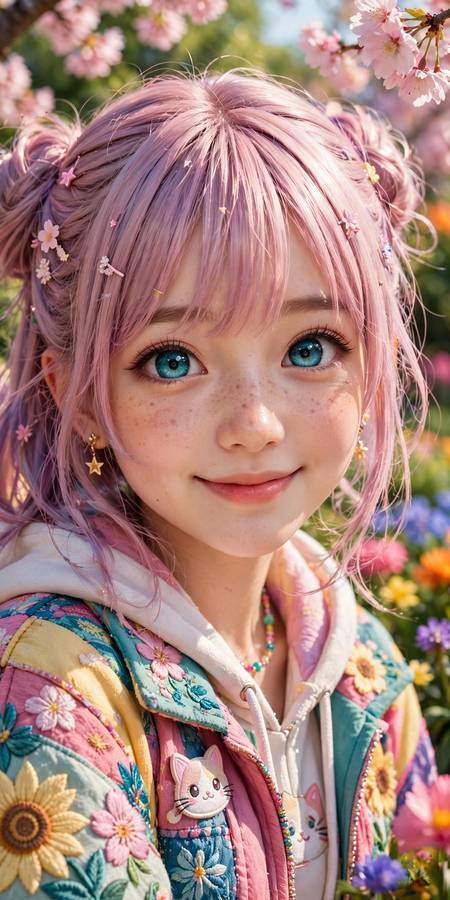
- Modern anime. “Anime key visual, vibrant, clean lineart, cel shading.” The default anime neighborhood — polished, colorful, contemporary.
- Studio Ghibli-esque. “Whimsical storybook anime, soft painterly backgrounds, nostalgic rural Japan feel.” (Describe the qualities rather than naming the studio for commercial work.)
- Retro anime. “1990s anime cel, film grain, muted colors” — a distinct, beloved aesthetic with its own nostalgic texture.
- Manga. “Black and white manga panel, screentone shading, dynamic speed lines.” Note: specify panel or page if you want the comic format, or you’ll get a color illustration.
- Western cartoon. “Cartoon Network style animation cel” vs. “Pixar-style 3D render” vs. “classic Disney hand-drawn.” Western animation splits into eras and studios the same way anime does.
- Chibi / stylized. “Chibi character, oversized head, cute proportions” — the super-deformed look, great for mascots and stickers.
Anime prompting rewards era and subgenre words. “Isekai,” “shonen,” “slice-of-life,” “mecha anime” each pull toward different visual conventions — the model learned genre as well as medium.
Digital and 3D Styles
The native styles of the screen era:
- 3D render. “Pixar-style 3D render, subsurface scattering, soft studio lighting” vs. “Unreal Engine 5 render, ray tracing” vs. “low-poly 3D game asset.” “3D render” alone is vague — specify the kind of 3D.
- Digital painting. “Epic fantasy digital painting, dramatic lighting, intricate detail” — the ArtStation house style. Powerful default for imaginative subjects; can look generic without specific direction.
- Concept art. “Environment concept art, painterly, atmospheric perspective” — looser than finished illustration, great for ideation and worldbuilding.
- Pixel art. “16-bit pixel art, limited palette, retro JRPG sprite” — specify the bit-era: 8-bit, 16-bit, and 32-bit pixel art look quite different. Charming and very controllable.
- Vector / flat design. “Flat vector illustration, minimal, corporate Memphis” (use that last term carefully — it’s divisive) vs. “geometric vector poster.” Clean, scalable-looking, perfect for icons and infographics.
- Voxel. “Voxel art diorama, tiny 3D cubes” — the Minecraft-adjacent aesthetic, delightful for small scenes.
Digital styles are where AI is most fluent — the training data is densest here — so they’re the most reliable starting points for beginners.
Retro and Vintage Styles
Nostalgia is a style family, and a commercially potent one:
- Mid-century illustration. “1950s advertisement illustration, atomic age, cheerful retro” — the golden age of print ads, endlessly reusable for friendly branding.
- Art Deco / Art Nouveau. “Art Deco poster, geometric gold ornament” vs. “Art Nouveau, flowing organic lines, Mucha-esque.” Two distinct historical styles people often conflate — learn the difference and your prompts improve instantly.
- Vintage photography. “1970s faded photograph, light leaks, warm cast” — nostalgia as a filter, distinct from actually old photos.
- Propaganda poster. “Constructivist poster, bold red and black, dramatic angles” — powerful graphic language, use thoughtfully given the political charge.
- Pulp and retro sci-fi. “1950s pulp sci-fi book cover, ray guns and rocket ships, painted” — campy, colorful, fun.
- Vaporwave / synthwave. “Vaporwave aesthetic, chrome statues, grid sunsets, 80s nostalgia” — internet-native retro, a style born digital.
Retro styles work commercially because nostalgia sells — but they’re also the styles where “vintage” alone is dangerously vague. Always pair it with an era.
Fantasy, Sci-Fi, and Genre Styles
Mood-first families where atmosphere is the style:
- Dark fantasy. “Dark fantasy illustration, moody, desaturated, gothic horror elements” — think Soulsborne, not high fantasy.
- Cozy fantasy. “Cozy fantasy art, warm light, storybook comfort” — the deliberate opposite, and a whole thriving aesthetic.
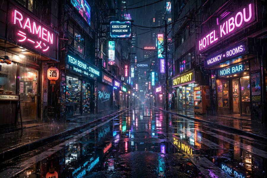
- Cyberpunk. “Cyberpunk, neon rain, dense signage, Blade Runner atmosphere” — but specify which cyberpunk: neon-noir, solar-punk’s optimistic cousin, biopunk’s organic tech.
- Solarpunk. “Solarpunk utopia, green architecture, bright hopeful future” — cyberpunk’s optimistic sibling, visually distinct.
- Space opera. “Epic space opera matte painting, vast scale, tiny ships” — grandeur as a style.
- Horror. “Analog horror, VHS grain, liminal spaces” vs. “cosmic horror, unknowable geometry, Lovecraftian dread” — horror subdivides by flavor of fear, and the words matter enormously.
Genre styles are carried by mood words as much as visual words. “Dread,” “wonder,” “melancholy,” “triumph” — the model maps emotional language to visual choices (palette, lighting, composition) with surprising fluency.
Combining Styles Without Chaos
The advanced move is style combination — and the failure mode is mud. Rules that keep combinations clean:
- One dominant, one accent. “Watercolor with ink outlines” works; “watercolor oil painting 3D render anime” is noise. Give one style the lead role.
- Combine adjacent neighborhoods. “Art Nouveau + stained glass” (historically related) blends smoothly. “Photorealism + ukiyo-e” can work but needs careful balancing — distant neighborhoods produce either genius or mush.
- Use “in the style of” for the frame, details for the subject. “Portrait in Art Deco style, the subject wearing modern streetwear” — style frames, subject fills. Clear division of labor.
- Test the combination’s name. If art history has a name for your combo (“Japonisme” = Japanese + Western art), use it — the model learned the named movement as a coherent neighborhood.
- When in doubt, subtract. The most common style-prompting mistake is accretion — adding more style words hoping for more style. Usually you get less. Pick the two strongest words and delete the rest.
And remember the ethics note from the broader debate: combining historical and generic styles is fair game; building prompts around living artists’ names for commercial work is where it gets uncomfortable. There’s a century of dead masters to learn from — start there. For how different platforms handle style, Stable Diffusion vs DALL-E compares the ecosystems.
Frequently Asked Questions
The major families are photorealism/photography, traditional painting (oil, watercolor, impressionism), anime/manga/cartoon, digital/3D (renders, pixel art, vector), retro/vintage (art deco, mid-century, vaporwave), and genre styles (cyberpunk, dark fantasy, solarpunk). Each responds to specific trigger words in prompts.
Use precise style words: name the medium (“oil painting,” “watercolor”), era (“1990s anime cel,” “Art Deco”), and technique (“impasto,” “cel shading”). Be specific — “anime” is vague, but “retro 90s anime cel with film grain” targets an exact look.
Yes — use one dominant style and one accent (“watercolor with ink outlines”). Combining historically related styles blends smoothly; distant combinations need careful balancing. Avoid stacking many style words, which produces muddy results.
Digital painting and 3D render styles are the most reliable for beginners because AI training data is densest there. “Epic fantasy digital painting” or “Pixar-style 3D render” produce strong results with simple prompts.
Describe the capture, not just the look: specify camera language like “85mm portrait photography, shallow depth of field, golden hour” or film stocks like “Kodak Portra 400.” Concrete photographic details guide the model far better than “beautiful photo.”