
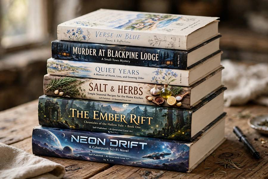
Your book cover is a marketing asset wearing an art costume — its job is to signal genre, promise a reading experience, and survive as a thumbnail. AI image generators are remarkably good at the art part and dangerously bad at understanding the marketing part. I’ve watched self-published authors go both directions: covers that look stunning and sell nothing (wrong genre signals), and covers that look AI-generic and sell nothing (no differentiation). The ones that work treat AI as one tool in a cover-design workflow, not as the workflow. Here’s how. The creative context: can AI make art.
Table of Contents
- What a Book Cover Actually Has to Do
- Where AI Art Shines for Covers
- Where AI Art Fails Covers
- Genre Expectations: The Rules You Must Follow
- The Typography Problem (and the Fix)
- The Recommended Workflow
- Rights, Disclosure, and Platform Rules
- When to Hire a Human Instead
- Frequently Asked Questions
What a Book Cover Actually Has to Do
Before generating anything, understand the job. A book cover has four functions, in order of importance:
- Signal genre instantly. A thriller reader scanning thumbnails must recognize “thriller” in under a second. Genre signaling is pattern-matching: color palettes, composition tropes, typography styles that readers have absorbed unconsciously. Get this wrong and the right readers scroll past.
- Promise a specific experience. Cozy mystery promises comfort; dark fantasy promises epic stakes; romance promises emotional payoff. The cover is a contract about what’s inside.
- Look professional at thumbnail size. Most covers are first seen at 100 pixels wide. If it doesn’t read as a thumbnail, it doesn’t matter how gorgeous the full-size version is.
- Stand out within the genre. Signal the category, then differentiate inside it. The paradox of cover design: look like the genre, but not like everyone else in it.
AI is excellent at 4-ish (novel imagery) and terrible at 1 (it doesn’t understand genre semiotics unless you do). That’s why AI-only covers so often look beautiful and sell poorly — they nail the art and miss the marketing. The workflow below puts genre first, generation second.
Where AI Art Shines for Covers
Credit where due — AI covers real advantages:
Speed and cost for testing. Generate twenty directions in an afternoon, test them against your genre’s bestsellers, pick a lane. Traditional cover design iterates slowly and expensively; AI lets you explore the design space before committing. For authors on tight budgets, this is transformative.
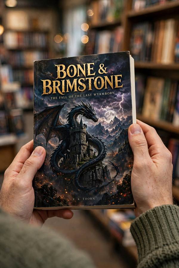
Fantasy, sci-fi, and horror imagery. These genres need imaginative, painterly, impossible imagery — exactly what diffusion models do best. Epic landscapes, creatures, atmospheric scenes, dramatic lighting: AI’s home turf. A self-published fantasy author in 2026 has access to cover art quality that cost thousands a decade ago.
Concept exploration. Even if you hire a designer, arriving with ten AI-generated directions (“I like this mood, this composition, this palette”) makes the human collaboration dramatically more productive. AI as a briefing tool is underrated.
Series consistency. Once you lock a style, generating matching covers for books 2-5 in a series is straightforward — same style words, same compositional templates, new subjects. Series branding on a budget.
Niche genres with no stock art. Some micro-niches (cozy paranormal mystery? dinosaur erotica? — I don’t judge) have thin stock-photo coverage. AI generates what stock libraries never shot.
Where AI Art Fails Covers
Honest limitations, because the failures are specific:
Genre illiteracy. AI doesn’t know that romance covers need couples in clinch poses, or that thriller covers use high-contrast minimalism, or that cozy mysteries use illustrated whimsy. It generates images; genre conventions are marketing knowledge you must supply. An AI cover designed without genre research is decoration, not a cover.
The AI look. There’s a recognizable diffusion-model aesthetic — smooth, over-rendered, slightly samey — and experienced readers are learning to spot it. In genres where craft signals quality (literary fiction, for instance), the AI look can actively repel the target audience.
Faces and hands at thumbnail scale. Cover art often features people; AI still struggles with anatomy, and flaws invisible at full size become obvious in print. Every AI cover needs a careful anatomy audit before it ships.
Text rendering. AI-generated title text is unreliable — garbled lettering, misspellings, weird kerning. (Improving, but not trustworthy.) Professional covers need typeset text, full stop.
Sameness. Thousands of authors prompting “epic fantasy castle” get variations on the same castle. The genres where AI is technically strongest are also where AI covers cluster most densely — differentiation requires deliberate effort.
Genre Expectations: The Rules You Must Follow
This is the section most AI-cover guides skip, and it’s the most important. Each genre has visual conventions — learn your genre’s before generating:
- Romance: couples (or suggestive partial figures), warm palettes, flowing typography. Subgenres vary enormously — contemporary romance looks nothing like historical romance.
- Thriller/mystery: high contrast, minimal elements, bold sans-serif type, often a single evocative object or obscured figure. Restraint signals tension.
- Fantasy: painterly scenes, epic scale, dramatic lighting, serif or custom display type. Subgenre matters: epic fantasy vs. romantasy vs. grimdark are visually distinct.
- Sci-fi: sleek tech, space vistas, neon or metallic palettes, futuristic typography. Hard SF vs. space opera differ.
- Horror: darkness, texture, unsettling imagery, distressed type. The cover should disturb slightly.
- Cozy mystery: bright illustrated style, whimsical elements, friendly typography. The anti-thriller.
- Nonfiction: clean, authoritative, often photographic or minimal graphic. Subtitle-heavy. AI imagery less common here — photography and graphic design dominate.
- Children’s: bright, character-forward, playful type. (Extra caution: AI’s anatomy issues matter more with young audiences, and the ethics of AI children’s illustration are debated.)
How to research: pull the top 100 bestsellers in your precise subgenre. Note the palettes, compositions, typography styles, and recurring motifs. Your cover must rhyme with these — then differ. Generate into the genre pattern, not around it. This research takes an afternoon and matters more than any prompt technique.
The Typography Problem (and the Fix)
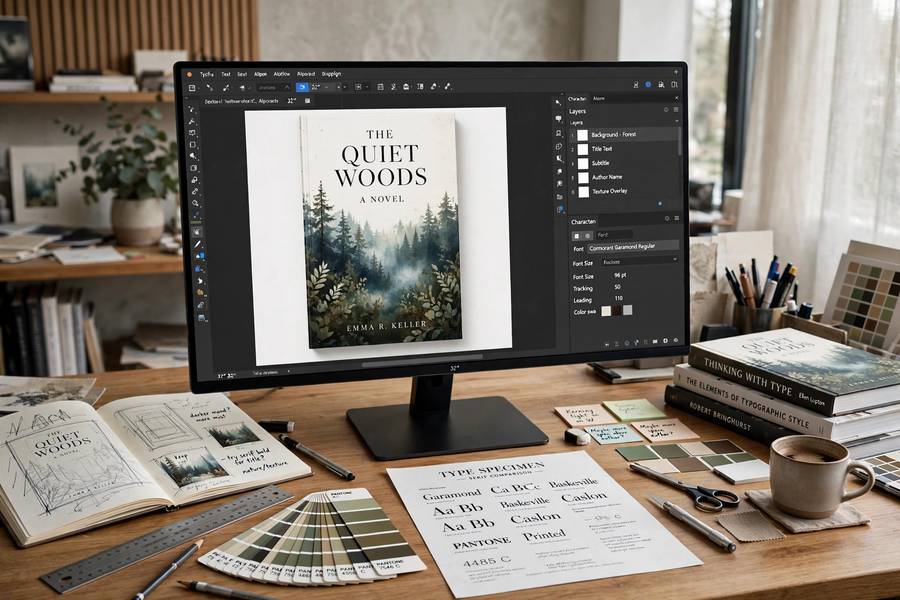
Title text makes or breaks covers, and it’s where AI-only workflows die. The fix is simple: never let the AI render your text. The professional workflow:
- Generate the background art only — no text, or with text areas left deliberately empty/simple.
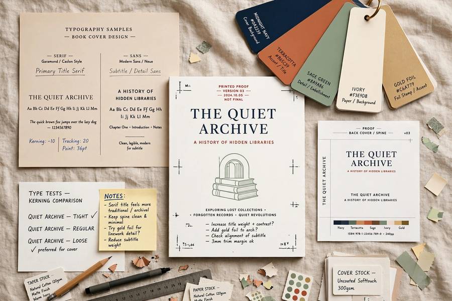
- Typeset the title, author name, and series info in real design software (Canva works; Photoshop/Affinity/InDesign are better) with real fonts.
- Composite: art + typography + finishing (color grading to unify, subtle textures, vignette).
Typography basics that matter enormously:
- Font choice signals genre as strongly as imagery. A thriller in a script font is a category error. Study your genre’s type conventions with the same seriousness as its imagery.
- Hierarchy: title dominant, author name secondary (unless you’re the brand — then reverse it), series info subtle.
- Legibility at thumbnail size. Test every cover at 100px wide. If the title isn’t readable, nothing else matters.
- Contrast and placement. Text needs quiet space behind it — plan your art generation with text zones in mind (“empty sky in upper third for title”).
Authors who typeset well and generate decent art outperform authors who generate stunning art and typeset badly. Typography is the higher-leverage skill — which is fortunate, because it’s also the more learnable one.
The Recommended Workflow
Putting it together — the workflow I’d recommend to a self-publishing author:
- Genre research (half day). Top 100 in your subgenre; document palettes, compositions, type styles, motifs.
- Concept directions (1 day). Generate 20-30 varied directions with AI, guided by the genre research. No text in generations.
- Thumbnail test. Shrink everything to 100px. Kill anything that doesn’t read. You’re usually left with 3-5.
- Full-size review. Anatomy check, artifact check, composition check on survivors. Regenerate or refine as needed.
- Pick one, develop it. Focused iteration on the winner: variations, refinements, the final art.
- Typeset professionally. Real fonts, real hierarchy, genre-appropriate choices. Get a second pair of eyes — fresh eyes catch what yours miss.
- Composite and finish. Unify with color grading; add spine and back cover for print (AI art can supply back-cover imagery too, kept subtle).
- Test with readers. Show the cover (without context) to target-genre readers: “what genre is this? would you click?” Their answers are worth more than any expert opinion, including mine.
- Print proof. Colors shift in print; AI art’s saturated palettes especially. Proof before you commit.
Total: a few days of focused work, minimal cost, professional-grade results — if you respect the genre research and typography steps. Skip those and you have pretty pictures, not covers.
Rights, Disclosure, and Platform Rules
The business-legal layer:
- Commercial rights depend on your plan. Midjourney’s paid tiers grant commercial use; check your specific generator’s current terms — they change. This is step zero, not an afterthought.
- Copyright is limited. In the US, purely AI-generated cover art likely can’t be copyrighted — meaning you can’t stop others using similar art, and “exclusive” cover claims are shaky. Your typesetting and design arrangement add human-authored elements, which helps.
- Platform disclosure. Amazon KDP asks about AI-generated content — answer honestly. Some distributors and marketplaces have AI-content policies; check each one’s current rules.
- Don’t promise what you can’t deliver. If you sell cover design services using AI, disclose the AI involvement and the copyright limitations to clients. It’s a contract issue as much as a legal one.
- Trademark caution. Keep generated art clear of recognizable characters, logos, and distinctive living-artist styles — especially for commercial covers where infringement exposure is real.
For significant commercial projects, double-check the U.S. Copyright Office’s latest guidance and your platform’s current terms. But covering these five points handles the standard cases.
When to Hire a Human Instead
AI covers are a legitimate option, not a universal one. Hire a human designer when:
- Your genre punishes the AI look. Literary fiction, high-end nonfiction, prestige genres — where craft signaling matters, human design pays for itself.
- You need original characters. If your cover features your protagonist and readers will compare across books, AI’s consistency limits become liabilities. A human illustrator builds your character.
- The book is your flagship. First-in-series, breakout attempt, major launch — the highest-stakes cover deserves the highest-craft approach, which is still human-led (possibly AI-assisted).
- You’ve tried and it’s not working. If three rounds of AI covers still miss the genre mark, that’s data: the problem needs a designer’s judgment, not more generations.
- You can afford it. Good cover designers charge $200-800 for indie work — real money, but often the highest-ROI spend in self-publishing. “AI is free” is only an argument if your time is worthless and the results equivalent.
The mature view: AI lowered the floor for acceptable covers and raised the value of excellent ones. Use AI where it’s sufficient; hire humans where excellence pays. Knowing which situation you’re in is the skill. For tool-specific technique, how to use Midjourney covers the generation side.
Frequently Asked Questions
Yes, if your AI generator’s paid plan grants commercial rights. AI works well for fantasy, sci-fi, and horror covers especially. Generate the art without text, typeset the title professionally in design software, and research your genre’s visual conventions first.
Amazon KDP asks publishers about AI-generated content — answer honestly. Disclosure requirements vary by platform, so check each distributor’s current AI-content policy before publishing.
Not reliably. AI text rendering produces garbled lettering and misspellings. The professional workflow is generating background art only, then typesetting the title, author name, and series info with real fonts in design software like Canva, Photoshop, or Affinity.
Fantasy, sci-fi, and horror — genres needing imaginative painterly imagery — play to AI’s strengths. Romance, thriller, and nonfiction rely more on photography, typography, and precise genre conventions where AI contributes less.
Use AI when budget is tight and your genre tolerates it; hire a human for prestige genres, original characters, flagship launches, or when AI attempts keep missing the mark. Many authors use AI for concept exploration even when hiring a designer for final execution.