How to Choose Wedding Colors: A Calm, Step-by-Step Guide

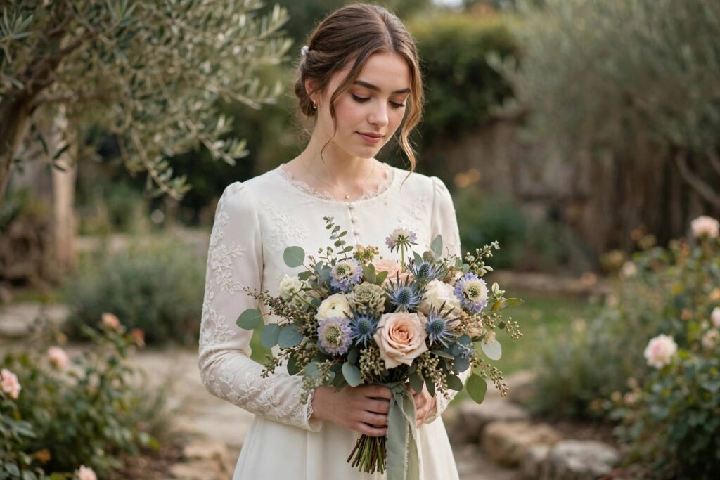
Of all the decisions you’ll make while planning a wedding, choosing your colors might feel like the most deceptively simple — and the most oddly stressful. It’s “just colors,” until you’re staring at forty shades of blush wondering if they’re all the same and somehow completely different. Take a breath. Learning how to choose wedding colors is really about understanding a few design principles, and then trusting your own taste. Let’s make this enjoyable instead of overwhelming.
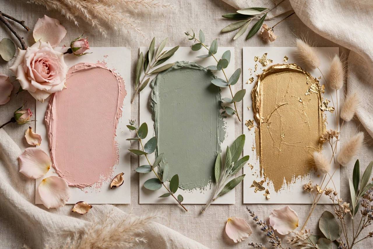
I’ll walk you through finding your starting point, building a palette that photographs beautifully, matching colors to your season and venue, and avoiding the mistakes I see couples make most often.
How to Choose Wedding Colors: Start With What You Love
Before you open a single inspiration board, ask yourselves: what colors are we drawn to in real life? Look at your home, your wardrobe, the art you love. The palettes you’re naturally surrounded by are the ones you’ll still love in your photos twenty years from now.
Trends are fun, but they date fast. The weddings that look timeless in photos are the ones built on colors the couple genuinely loves, not colors that were having a moment on social media. That said, there’s nothing wrong with borrowing a trending accent — just anchor your palette in shades with personal meaning, and let trends be the garnish, not the meal.
A lovely exercise: each of you separately picks five colors you love, then compare lists. The overlap is your foundation. It’s also a sweet little moment of discovering where your tastes meet — very on-brand for wedding planning.
The Simple Formula: A 3-Color Palette
Professional designers build wedding palettes on a simple structure: one main color, one secondary color, and one neutral or metallic accent.
- Main color (about 60%): the dominant tone — your bridesmaid dresses, major florals, linens. Sage green, dusty blue, terracotta, blush.
- Secondary color (about 30%): the supporting player — groomsmen accents, secondary blooms, signage. It should complement, not compete.
- Accent (about 10%): the jewelry of the palette — gold flatware, copper details, a pop of a bolder shade in the bouquet.
This 60-30-10 balance is why some weddings look effortlessly cohesive while others look busy: the cohesive ones restrain themselves. When every element screams for attention, nothing gets it.
As you build your overall plan, a structured planning checklist helps you slot color decisions into the right planning phase — palette choices made early make every later decision (flowers, attire, stationery) easier.
Match Your Palette to Season and Venue
Season and venue do half the design work for you if you let them:
Spring: soft pastels, fresh greens, light and airy tones — blush, lavender, sage, butter yellow. Nature is already decorating; echo it.
Summer: you can go bolder — vibrant corals, bright blues, sunny yellows — or lean into romantic neutrals with lots of greenery. Outdoor light is strong, so colors read more vividly.
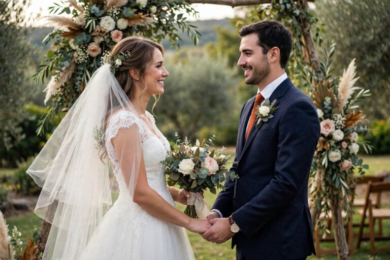
Fall: rich, warm tones shine — burgundy, burnt orange, deep plum, gold, forest green. Fall palettes photograph gorgeously against autumn landscapes.
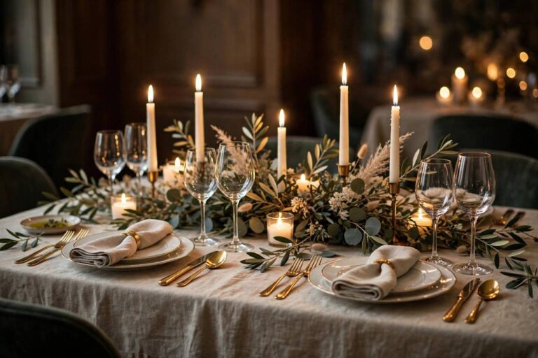
Winter: deep jewel tones, dramatic contrasts — emerald and gold, navy and silver, classic red and green done elegantly. Candlelight makes rich colors glow.
Venue matters just as much. A rustic barn loves warm earth tones; a modern art gallery loves bold minimalism; a garden venue loves soft botanicals. Visit your venue, photograph it in your mind’s eye, and choose colors that converse with the space rather than fighting it. winter wedding ideas ideas show how beautifully season and setting can harmonize.
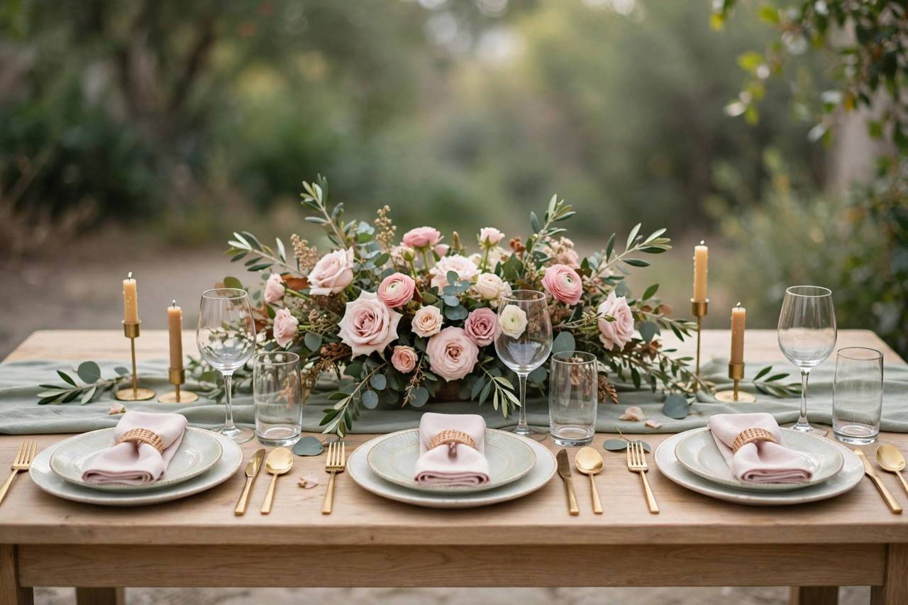
Test Your Colors Before You Commit
Never choose a palette from a phone screen alone. Screens lie — the same “dusty rose” looks different on every display and in every light. Order fabric swatches of your main colors and look at them together in natural daylight, in your venue if possible.
Photograph the swatches together. Your wedding will live on in photos, so the camera’s opinion matters: some color combinations that look fine in person photograph muddy, while others pop beautifully. A quick phone photo of your swatches in daylight is a surprisingly good test.
Also consider your flowers realistically. Some colors barely exist in nature at certain times of year — that perfect shade of blue is notoriously hard in fresh flowers. Your florist is your best consultant here: bring your swatches to the consultation and ask what’s actually achievable in your season.
Here’s a testing trick most couples skip: photograph your palette in your actual venue lighting. Colors shift dramatically under warm Edison bulbs versus daylight versus LED uplighting. Take your swatches to the venue (or ask your planner to), snap photos at the time of day your event will happen, and look at them on your phone — because that’s how most of your guests will experience your wedding, through photos. A dusty blue that looks perfect in the stationery shop can turn gray-purple under warm light, and it’s much better to discover that now than on the wedding day.
Also test your colors together, not just individually. Lay the bridesmaid dress swatch next to the linen sample next to the invitation next to the flower varieties you’re considering. Colors behave differently in combination — a combination that looks harmonious in your head can clash on the table. This one 20-minute exercise prevents more palette regret than anything else I recommend.
Common Wedding Color Mistakes to Avoid
Too many colors. Five “main” colors isn’t a palette, it’s a rainbow. Restraint reads as elegance.
Ignoring the venue’s existing colors. That burgundy carpet or those green walls aren’t going anywhere — work with them or choose a venue that matches your vision.
Forgetting the groom’s party and families. Your palette has to work for everyone wearing it. Check suit and dress options early for unusual shades.
Choosing colors that photograph poorly together. Neon brights next to pastels, or red and pink without a bridging neutral, can look jarring in photos. When in doubt, add a neutral.
Letting others choose. Well-meaning family opinions are lovely; a palette you don’t love is not. This is one decision to hold gently but firmly.
One more mistake I see constantly: choosing colors before booking the venue. Your venue has fixed colors you can’t change — carpet, walls, wood tones, existing drapery. A blush-and-gold palette fights a venue with burgundy carpet and dark wood paneling; it surrenders to a bright white garden conservatory. Lock the venue first, then choose colors that work with the space rather than against it. Your decor budget will thank you too, because you’ll need far less of it when the venue is already doing half the visual work.
And please — don’t pick seven colors. I know everything is beautiful and you want it all. But a palette with more than four colors stops reading as a palette and starts reading as “no palette.” If you’re torn, pick your top three and demote the rest to tiny accents. Restraint photographs better, coordinates easier, and costs less.
Bringing It All Together
Once your palette is set, create a simple one-page reference — swatches, color names, and where each appears (attire, flowers, stationery, decor). Share it with your florist, planner, and anyone making color decisions. This single page prevents the slow drift where every vendor interprets “blush” slightly differently.
And remember: the goal isn’t a magazine spread, it’s a day that feels like you. The couples whose weddings guests remember fondly aren’t the ones with the most on-trend palette — they’re the ones whose choices felt personal and intentional. Choose colors you love, apply them with restraint, and the rest will fall beautifully into place. If you’re still mapping out the big picture, how to plan a wedding walks through the full planning timeline step by step.
Palettes Couples Are Loving Right Now
Trends come and go, but it helps to know what’s in the air — sometimes seeing what’s popular helps you realize what you don’t want, which is just as valuable. Here’s what I’m seeing couples choose lately, and why each one works.
Warm neutrals with one rich accent. Think champagne, taupe, and warm ivory anchored by something with depth — burnt sienna, deep olive, or oxblood. This palette photographs beautifully, flatters every skin tone in the wedding party, and never looks dated in ten years. It’s the current favorite for a reason.
Garden-inspired pastels, but moodier. Couples still love blush and sage, but they’re grounding them with deeper tones — a dusty mauve instead of baby pink, eucalyptus instead of mint. The result feels romantic without feeling saccharine, and it works across seasons.
Bold jewel tones for evening weddings. Emerald, sapphire, and amethyst are having a moment for fall and winter celebrations, especially in velvet textures and candlelit venues. Dramatic, yes — but in the right venue, absolutely unforgettable.
Black and white, done properly. The eternal classic, but the couples doing it now are adding texture instead of a third color — black taper candles, white orchids, linen textures. Restraint is the whole point.
A note of caution from someone who’s seen the cycle a few times: pick the palette you’d still love if you’d never seen it on social media. Trends are inspiration, not instruction.
FAQ
How many colors should a wedding palette have?
Three is the sweet spot: one main color (about 60%), one secondary color (about 30%), and one neutral or metallic accent (about 10%). This balance looks cohesive without being boring.
Should wedding colors match the season?
They don’t have to, but working with the season makes everything easier — flowers are more available and affordable in season, and the natural surroundings complement your palette in photos.
How do I choose wedding colors for my venue?
Consider the venue’s existing colors, lighting, and style. Visit the space, note fixed elements like carpet or walls, and choose a palette that converses with the space rather than fighting it.
What wedding colors photograph best?
Cohesive palettes with a clear neutral base photograph best. Test your swatches with phone photos in natural daylight — some combinations that look fine in person appear muddy on camera.
When should we finalize our wedding colors?
Early — ideally when you book your venue, since color choices drive decisions about flowers, attire, stationery, and decor. Finalize before major vendor consultations so everyone works from the same palette.
Should the wedding party outfits match the wedding colors exactly?
They should coordinate, not clone. An exact match across bridesmaids’ dresses, groomsmen’s ties, linens, and flowers can look flat and overdone — like a paint swatch came to life. Instead, dress the wedding party in one or two of your palette colors (often the deeper tones, which photograph better on people) and let the lighter or brighter colors live in the flowers and decor. Slight variation in shade among bridesmaids is also completely fine and often looks more modern and relaxed.