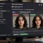

Of all Midjourney’s parameters, --stylize is the most misunderstood. I’ve watched users crank it to 1000 expecting “maximum quality” and get back dreamy images that ignored half their prompt. I’ve watched others leave it at default forever, never knowing the dial existed. Both are leaving results on the table.
The stylize parameter controls one thing: how much Midjourney’s own aesthetic opinion influences your image versus how literally it follows your prompt. That’s it — but that one thing changes everything about the output. This guide explains the scale, shows when to go low or high, and gives you practical defaults. Background reading: how Midjourney works and prompt engineering basics for beginners.
Table of Contents
- What –stylize Actually Controls
- The Scale: 0 to 1000
- Low Stylize (0-100): Literal Mode
- Medium Stylize (100-400): The Working Range
- High Stylize (500-1000): Dream Mode
- Stylize vs Style Keywords: Don’t Confuse Them
- Practical Defaults for Common Tasks
- Stylize Across Model Versions
- Pairing Stylize With –chaos
- Finding Your Signature Value
- Stylize and Image Quality: A Quick Note
- Frequently Asked Questions
What –stylize Actually Controls
Every Midjourney generation balances two forces: your prompt’s instructions and the model’s trained aesthetic preferences — its “taste,” learned from millions of beautiful images. The --stylize parameter (or --s) sets that balance.
Low stylize = the model follows your words closely, adding minimal artistic interpretation. High stylize = the model takes creative liberties, prioritizing beauty and artistry over literal accuracy. Neither is “better” — they’re different tools. The default (around 100 in recent versions, though defaults shift) sits in the middle: faithful enough, pretty enough. Understanding this tradeoff is the whole game.
The Scale: 0 to 1000
The parameter accepts values from 0 to 1000. In practice, the useful range clusters into three zones, and the differences between adjacent values (say, 250 vs 300) are subtle — think of it as a coarse dial, not a precision instrument. The jumps that matter are between zones: 50 vs 250 vs 750 produce visibly different philosophies of image-making.
One important note: stylize interacts with model versions. The same --stylize 500 behaves differently across versions because each version has different default aesthetics. When Midjourney updates its model, re-test your favorite values rather than assuming they carry over.
Low Stylize (0-100): Literal Mode
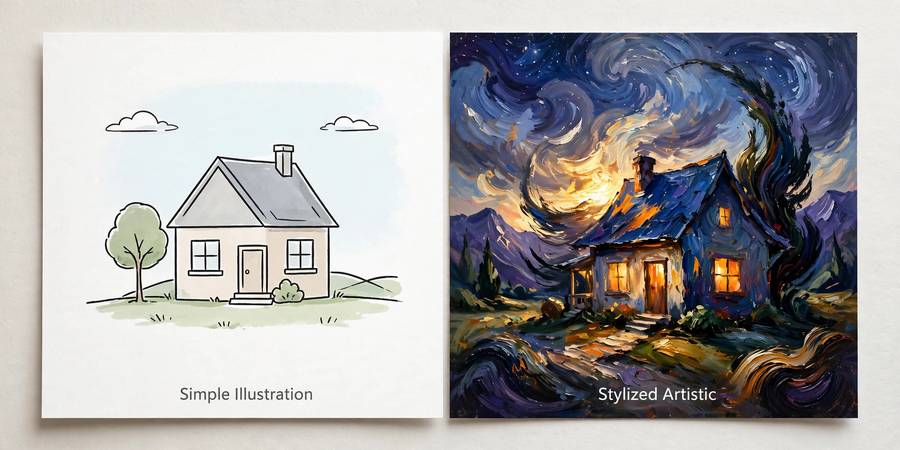
At low values, Midjourney becomes obedient. --stylize 0 to --stylize 50 produces images that track your prompt closely: the composition you described, the elements you listed, minimal decorative flourishes the model invented on its own.
When to use it: product mockups where accuracy matters, technical illustrations, images with specific spatial arrangements, any case where “pretty but wrong” is worse than “plain but right.” The tradeoff is real — low-stylize images can look flat or generic, lacking the cinematic richness Midjourney is famous for. You’re trading beauty for control, deliberately. For instruction-heavy work, this is often the right trade; for art, it usually isn’t.
Medium Stylize (100-400): The Working Range
This is where most good work happens. The model follows your prompt faithfully while applying its aesthetic judgment to lighting, composition polish, color harmony, and texture — the things it’s genuinely better at than most prompt-writers.
My practical default: --stylize 250. It’s the value I return to when I don’t have a reason to choose otherwise — enough artistry to make images sing, enough fidelity to keep them on-brief. The 100–400 band is also the most forgiving: small changes here nudge rather than transform, so it’s safe to experiment. If you’re learning the parameter, spend a week living in this range before venturing higher.
High Stylize (500-1000): Dream Mode
Push past 500 and Midjourney stops being your illustrator and becomes your collaborator — or your art director with strong opinions. Images get more dramatic lighting, richer textures, more adventurous compositions… and less connection to your specific instructions. At --stylize 1000, the prompt is a suggestion and the model’s taste is the law.
When to use it: pure art, wallpapers, fantasy and surreal work, anything where vibe matters more than accuracy. The results can be breathtaking — this is where Midjourney’s most-shared images live. When to avoid it: anything with requirements. Product shots, specific scenes, text-adjacent work, client briefs with checklists. High stylize plus a detailed brief equals beautiful disappointment.
Stylize vs Style Keywords: Don’t Confuse Them
Beginners conflate two different things: the --stylize parameter and style words in the prompt (like “cyberpunk” or “watercolor”). They’re independent controls.
Style keywords choose the aesthetic universe — what the image looks like. Stylize chooses how aggressively the model pursues beauty within that universe — how far it goes. You can have low-stylize cyberpunk (faithful but plain neon city) or high-stylize cyberpunk (a neon fever dream that may forget your brief). Set the universe with words, set the intensity with the parameter. They’re the two axes of the same control panel, and mastering both is what separates deliberate creators from lucky ones. Setup basics are in how to use Midjourney.
Practical Defaults for Common Tasks
Cheat sheet — start here, adjust to taste:
- Product mockups: –stylize 50 (accuracy first)
- Portraits: –stylize 250 (flattering but faithful)
- Blog headers: –stylize 250–400 (polished, on-topic)
- Fantasy/sci-fi art: –stylize 500–750 (let it dream)
- Wallpapers: –stylize 750–1000 (maximum beauty)
- Technical diagrams: –stylize 0–50 (literal mode)
- Social media posts: –stylize 250 (reliable pop)
Run the same prompt at 50, 250, and 750 once — a single experiment that teaches more than any guide. You’ll see the tradeoff with your own eyes, and you’ll never again wonder what the parameter does.
Stylize Across Model Versions
An important wrinkle: –stylize doesn’t mean the same thing across Midjourney versions. Each model version has its own baseline aesthetic and its own interpretation of the scale — stylize 250 on one version can look like stylize 500 on another. When Midjourney ships a new model, your tuned values don’t automatically transfer.
The practical response: whenever you switch versions, run a calibration test — your three or four most-used prompts at your standard stylize value, compared against the old version’s output. Adjust until the feel matches, then note the new equivalent value. Keep a version-to-value mapping in your prompt notes. It takes twenty minutes and saves weeks of subtly-off generations. Treat model upgrades like getting a new camera: the fundamentals transfer, but you recalibrate the settings.
Pairing Stylize With –chaos
Stylize has a frequent companion worth understanding: –chaos, which controls how varied the four images in a grid are (0–100). They interact interestingly. High stylize with low chaos gives you four similarly beautiful interpretations of your prompt — great for picking the best execution of one vision. High stylize with high chaos gives you four wildly different artistic takes — great for exploration when you’re not sure what you want.
My favorite combos: –stylize 250 –chaos 10 for client work (controlled, professional, pick the best of similar options), and –stylize 750 –chaos 60 for personal art exploration (surprise me beautifully). Low stylize with high chaos is the odd one — literal but varied, useful when you need accuracy but want compositional options. Learn the pair and you control both the beauty axis and the variety axis independently.
Finding Your Signature Value
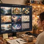
Here’s an exercise worth doing once: take five prompts representing your typical work, run each at stylize 100, 250, 500, and 750, and lay out the twenty results. You’ll discover your personal sweet spot fast — the value where the images feel like yours. Most creators land somewhere consistent: illustrators often prefer 400–700, product visualizers 50–150, photographers 150–300.
Once you find it, make it your default — set it in /settings or append it habitually. Consistency of stylize value across a body of work is part of what creates a recognizable style; varying it randomly is like changing film stock every shot. Professionals don’t use the “best” value — they use their value, deliberately, every time. That’s the difference between generating images and having a practice.
Stylize and Image Quality: A Quick Note
One persistent confusion to clear up: –stylize has nothing to do with resolution or detail quality. A –stylize 1000 image isn’t “higher quality” than a –stylize 50 image — it’s more artistically interpreted. Detail and sharpness come from upscaling and the quality parameter, independent of stylize.
This matters because beginners sometimes crank stylize hoping for sharper images and get dreamier ones instead — then crank further, compounding the confusion. If your images lack detail, the fix is upscaling and good prompting, not more stylize. If your images lack beauty, that’s when stylize earns its keep. Keep the two axes separate in your head: stylize controls artistic interpretation, upscaling controls fidelity. Different dials, different jobs, and knowing which to turn is half the craft.
Frequently Asked Questions
The –stylize parameter (0-1000) controls how much Midjourney’s aesthetic preferences influence the image versus literal prompt-following. Low values mean obedient, accurate images; high values mean more beautiful, artistic images that may stray from the prompt.
–stylize 250 is the best all-around default: faithful to the prompt with good artistic polish. Use 0-100 for accuracy-critical work like mockups, and 500-1000 for pure art where beauty matters more than precision.
No — high stylize means more artistic interpretation, not higher quality. At –stylize 1000 images can be stunning but may ignore parts of your prompt. Quality (detail, resolution) is controlled separately by upscaling.
Style keywords (cyberpunk, watercolor) choose the aesthetic universe; the –stylize parameter controls how aggressively Midjourney pursues beauty within it. They’re independent: you can have low-stylize cyberpunk or high-stylize watercolor.
At the end of the prompt with other parameters, e.g. “/imagine prompt: forest cabin at dusk, cozy –ar 16:9 –stylize 250”. You can also abbreviate it as –s.
Keep reading: