
I burned through a shocking amount of GPU time my first month on Midjourney, and most of it was my own fault. I had --q 2 stapled to every prompt like a lucky charm, convinced it was the secret to better images. It wasn’t. It was the secret to slower images and an empty subscription. The --quality parameter is one of Midjourney’s most misunderstood settings, and once I actually learned what it does, my renders got faster and my images didn’t get worse. Here’s the full picture. If you’re new to the tool itself, start with how Midjourney works — this guide picks up where that one leaves off.
Table of Contents
- The One-Paragraph Version
- What –quality Actually Controls
- The Four Settings: –q .25, .5, 1, and 2
- Quality vs. Detail: The Myth I Believed
- How –quality Affects Your GPU Minutes
- When to Use Each Setting
- What –quality Can’t Fix
- Parameters That Interact With –quality
- Frequently Asked Questions
The One-Paragraph Version
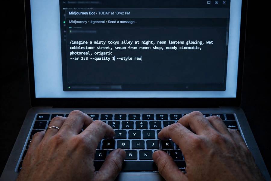
The --quality (or --q) parameter controls how much rendering effort Midjourney puts into an image. Higher values mean more processing passes, which can produce finer detail and cleaner textures — but the image takes longer, costs more GPU time, and usually looks barely different from the default. The default --q 1 is the right choice for almost everything. You lower it to save time and GPU minutes during experimentation, and you raise it only when you’re polishing a final image and want every last drop of refinement.
What –quality Actually Controls
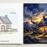
Midjourney generates images through a diffusion process — it starts with noise and gradually refines it into a coherent picture over many steps. The --quality parameter adjusts how much compute goes into that refinement. Think of it like the difference between a quick sketch pass and a careful multi-layer painting session.
Technically, higher quality settings let the model spend more effort on denoising and detail synthesis. At --q 2, the model does roughly twice the work of the default. But — and this is the part the hype skips — more work doesn’t mean a “better” image in any automatic sense. It means more refined texture rendering, smoother gradients, and slightly cleaner fine details. The composition, the subject, the lighting, the style — all the things that actually make an image good — are decided by your prompt and the model’s understanding, not by the quality dial.
I like to think of it as polishing. A well-cut gem polished twice looks marginally better than polished once. A badly cut gem polished four times is still a badly cut gem. Your prompt does the cutting; --quality does the polishing.
The Four Settings: –q .25, .5, 1, and 2
There are four accepted values, and each one is a tradeoff:
–q .25 (lowest). A quarter of the default effort. Images come out fast and rough — fine details blur, textures simplify, small faces get mushy. The upside is speed and cheap GPU usage. I use this for composition experiments: testing whether a layout works, whether the subject placement reads, whether the color palette feels right. Ugly but informative.
–q .5 (half). Half the default effort. Noticeably cleaner than .25, still clearly a draft. Good middle ground for iterating on prompts where you care about roughly-right details but aren’t committed yet.
–q 1 (default). Full default rendering. This is what you get when you don’t specify anything, and it’s what most great Midjourney images you’ve ever seen were made with. Full detail, full textures, normal speed. If you remember nothing else from this guide, remember this: the default is excellent.
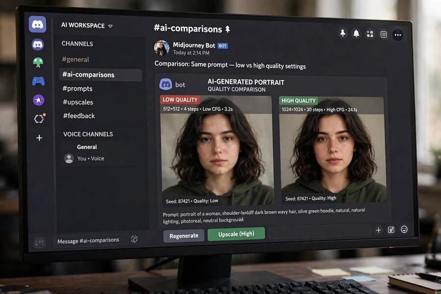
–q 2 (maximum). Double the default effort. Marginally finer detail, slightly cleaner micro-textures, noticeably longer renders, and roughly double the GPU cost. The visual difference between --q 1 and --q 2 is small enough that in blind comparisons, many people can’t reliably tell them apart. The main thing you reliably get is a longer wait.
One more thing: not all model versions accept every value. Some versions cap at --q 1. If you set a value your model version doesn’t support, Midjourney just ignores it or warns you. No harm done, but know the ceiling depends on the version you’re running.
Quality vs. Detail: The Myth I Believed
Here’s the myth I carried around for weeks: “higher quality = more detailed image.” It sounds right. It’s mostly wrong.
Detail in an AI image comes from your prompt — from asking for specific textures, materials, and visual information. “A weathered leather satchel with brass buckles, cracked patina, stitching visible” gives you detail. Slapping --q 2 on “a bag” gives you a smoothly rendered vague bag. The parameter can’t invent visual information your prompt didn’t ask for; it can only render what’s there more carefully.
I ran this experiment myself once: the same prompt at --q 1 and --q 2, side by side, ten pairs. In maybe three pairs I could spot a difference when zoomed in — slightly cleaner fabric weave, slightly less noisy background blur. In the other seven, I was guessing. The prompt quality dominated every single comparison. A good prompt at --q 1 beat a lazy prompt at --q 2 every time, and it wasn’t close.
So the honest framing: --quality adjusts rendering fidelity, not image richness. Fidelity is real, but it’s the last 5%.
How –quality Affects Your GPU Minutes
This is where the parameter actually matters — your wallet.
Midjourney subscriptions include a monthly allowance of fast GPU time. Every render draws from it, and the draw scales with --q. Roughly: --q 2 costs about double the GPU time of --q 1, while --q .5 costs about half and --q .25 about a quarter. The exact accounting has shifted across versions, but the proportions hold.
Do the math on a real workflow. Say you generate 60 draft images while developing a concept — at --q 1, that’s 60 units of GPU spend. At --q .5, it’s 30. At --q .25, it’s 15. You just saved three-quarters of your experimentation budget with images that were perfectly adequate for judging composition and concept. Then you spend your savings rendering the three finalists at --q 1 or --q 2.
When I switched to this workflow — draft low, finalize high — my monthly GPU usage dropped by about half with zero decline in final image quality. The parameter is a budgeting tool wearing a quality costume. Once you see it that way, the right move is obvious: how to use Midjourney efficiently starts with treating GPU minutes like money, because they are.
When to Use Each Setting
Here’s my practical cheat sheet, earned through that expensive first month:
Use –q .25 when: testing composition, trying wild prompt variations, generating batches to compare concepts, or working on a tight GPU budget. Accept the roughness.
Use –q .5 when: iterating on a promising direction and you want to see details well enough to judge them — facial expressions roughly, texture direction, whether the lighting reads. My most-used draft setting.
Use –q 1 when: generating anything you might actually keep. Portfolio pieces, client work, social posts, print candidates. The default is the workhorse; let it work.
Use –q 2 when: you have a final image with intricate fine detail — lace, engraving, dense foliage, photorealistic skin texture close-ups — and you want the maximum refinement pass. Also useful for large-format prints where micro-detail matters at scale. For everything else, skip it and save the minutes.
One more rule of thumb: if you’re upscaling anyway (U1-U4 buttons), the upscale itself does heavy refinement. A --q 1 image upscaled beats a --q 2 non-upscaled image in most cases, at lower total cost.
What –quality Can’t Fix
Cranking the quality dial won’t rescue a bad prompt, and it’s worth being explicit about what the parameter cannot do:
- It can’t fix bad composition. A cluttered, unbalanced image at
--q 2is a polished cluttered image. - It can’t fix wrong anatomy. Six-fingered hands rendered at maximum quality are still six fingers. Fix hands with prompt engineering and regeneration, not quality settings.
- It can’t add detail you didn’t request. Vague prompts produce vague images at every quality level.
- It can’t change style. If the aesthetic is wrong,
--stylizeand your style words are the levers, not--q. - It can’t fix text. AI-generated text in images is garbled at
--q .25and garbled at--q 2. (Newer model versions handle short text better regardless of quality setting.)
Every time I’ve been tempted to raise --q to fix a problem, the real fix was rewriting the prompt. Nine times out of ten.
Parameters That Interact With –quality
--quality doesn’t operate alone. A few interactions worth knowing:
–stylize. This controls how strongly Midjourney applies its own aesthetic preferences versus your literal prompt. It interacts with quality because a highly stylized render at low quality can look intentionally painterly — sometimes a feature, not a bug. Low --q plus mid --stylize is actually a nice recipe for concept-art vibes.
–chaos. Higher chaos means more varied results across the grid. Combined with low --q, chaos becomes a cheap brainstorming machine: fast, varied, rough. I love --q .25 --chaos 50 for early ideation.
Aspect ratio (–ar). Wider or taller images have more pixels to fill, so quality differences become slightly more visible at extreme aspect ratios. Not a big deal, but if you’re doing a cinematic 21:9 at --q 2, expect the render to take a while.
Model version (–v). Newer versions render so much detail at default that --q 2 matters less than it used to. The gap between .25 and 1 stays meaningful; the gap between 1 and 2 keeps shrinking. My prediction: eventually --q 2 becomes a legacy option nobody needs. For now, it’s there.
If you’re comparing generators too, it’s worth knowing how the underlying tech differs — what Stable Diffusion is explains the open-source alternative, which handles the quality-vs-speed tradeoff through steps and sampler settings rather than a single dial.
Frequently Asked Questions
The –quality (or –q) parameter controls how much rendering effort Midjourney puts into an image. It accepts .25, .5, 1 (default), and 2. Higher values mean more refined detail but longer renders and higher GPU-time cost.
Only marginally. The –q 2 setting adds slightly finer micro-detail compared to the default –q 1, but the difference is small and most viewers can’t tell in blind comparisons. Prompt quality matters far more than the quality setting.
Stick with the default –q 1. It’s excellent for final images, and you can drop to –q .5 or –q .25 while experimenting to save GPU minutes. Beginners should focus on prompt writing, not the quality dial.
Yes. GPU cost scales with the quality setting — –q 2 costs roughly double the GPU time of –q 1, while –q .5 costs about half and –q .25 about a quarter. Drafting at low quality and finalizing at high quality saves significant GPU time.
No. The –quality parameter only refines rendering fidelity; it can’t fix composition problems, wrong anatomy, or garbled text. Those need prompt rewrites and regeneration, not higher quality settings.